
The Fundamentals Table condenses a company’s income statement, balance sheet, and cash-flow statement into one scrollable grid — one row per reporting period, one column per line item — alongside computed margins and leverage ratios. It sits on every company page in ValueMap (at valuemap.io/stocks/<symbol>, in the Fundamentals section) and has its own full-width page at valuemap.io/stocks/<symbol>/fundamentals. It needs a ValueMap login, and a subscription unlocks the full window: up to ten fiscal years plus a trailing-twelve-month row, or up to forty-eight quarters. The table at the top of this page shows Apple (AAPL).
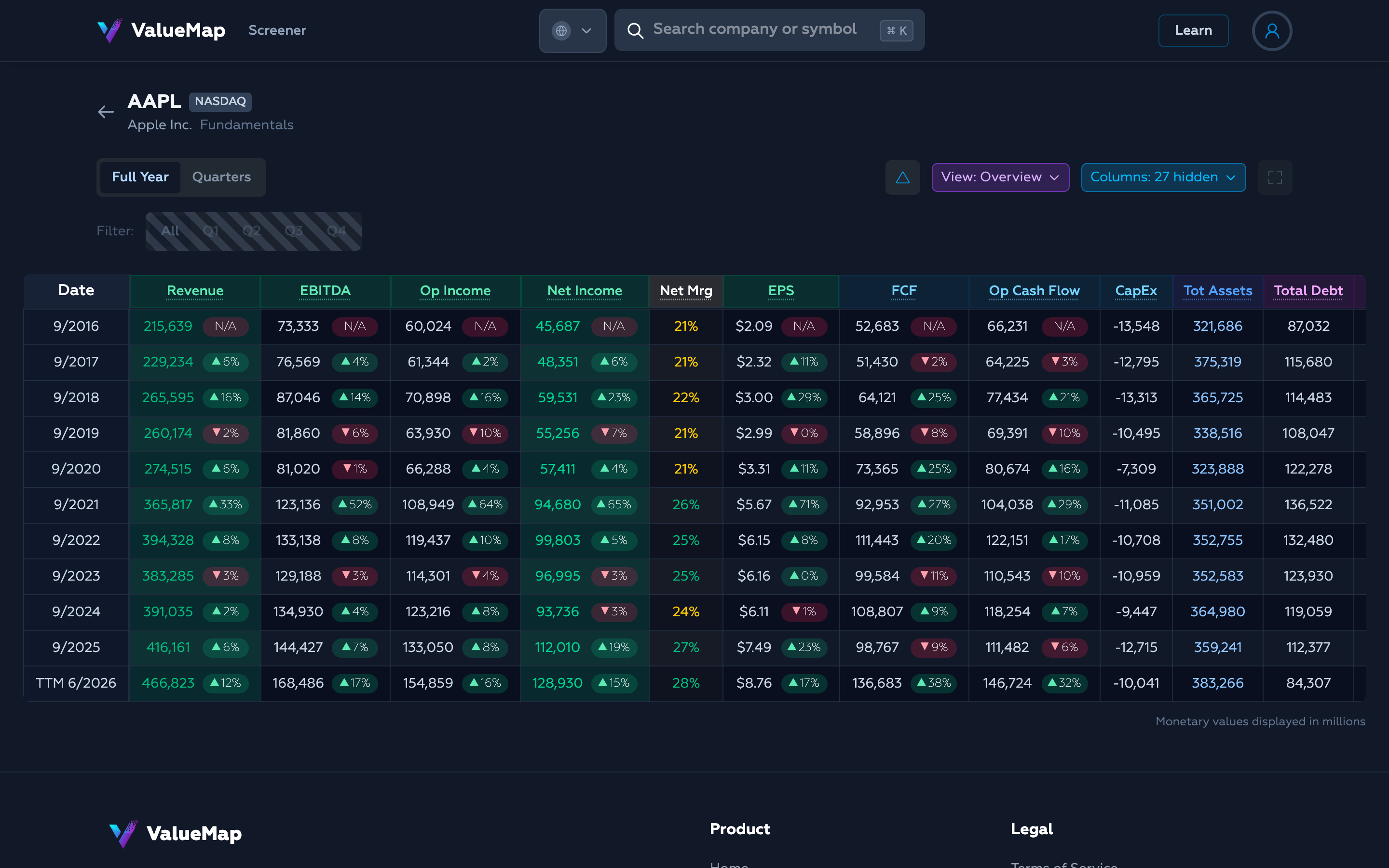
Every figure is as-reported, taken straight from the company’s filings, and lands on the table when the filing does. Monetary values are shown in millions of the company’s reporting currency (the note under the table says as much); per-share figures like EPS are shown in full.
Full Year and Quarters
Two tabs at the top left switch the reporting period. Full Year is the default.
Full Year lists up to the last ten fiscal years, and — when the most recent data is not a completed Q4 — adds a trailing-twelve-month row as the newest line, labelled TTM. TTM sums the last four reported quarters, so it is the most current annualized picture available between annual reports.
Quarters lists up to the last forty-eight quarters (about twelve years) and adds a Period column marking each row Q1–Q4. The table is sorted oldest-to-newest and scrolls to the bottom on load, so the most recent period is the first thing you see.
Filtering by quarter
In the Quarters tab, a segmented control filters the rows down to a single fiscal quarter.

All shows every quarter; picking Q1, Q2, Q3, or Q4 keeps only that quarter across all years. That isolates a single point in a company’s seasonal cycle — useful for a retailer whose fourth quarter dwarfs the other three, where comparing Q4 to Q4 is the only honest year-over-year read. The control is disabled (and shown with a hatched overlay) in the Full Year tab, where it has nothing to filter.
Views: the column presets
There are far more line items than fit on one screen, so the View dropdown curates them into focused sets. Picking a preset sets the visibility of every optional column at once.
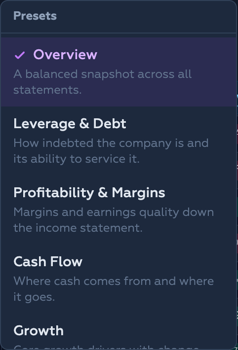
Five presets are available:
- Overview (default) — a balanced snapshot across all three statements.
- Leverage & Debt — debt, cash, and the ratios that measure how much of it a company carries and whether it can service it.
- Profitability & Margins — the margins and earnings figures down the income statement.
- Cash Flow — where cash comes from and where it goes.
- Growth — the core growth drivers, meant to be read with the change indicators on.
The button labels the active preset. As soon as you show or hide a column by hand, it reads Custom instead — you are no longer on a named preset.
Choosing columns
The Columns dropdown is the manual control behind the presets. It lists every optional column, grouped by statement.
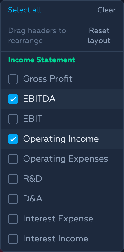
Columns are grouped as Income Statement, Ratios & Margins, Cash Flow, Balance Sheet, and Payout; each header is tinted to match its group’s colour in the table. Tick or untick to show or hide, or use Select all / Clear at the top. A badge on the button reports how many columns are currently hidden. Your choices persist in your browser between visits.
Three columns are fixed and never appear in this list: Date is always the pinned first column, Revenue is always shown as the income-statement anchor, and Period appears automatically in the Quarters tab. A couple of ratios (Debt/EBITDA and Net Debt/EBITDA) are Full-Year-only and drop out of the list in the Quarters tab, where a single quarter’s EBITDA would distort them.
Rearranging columns
Beyond showing and hiding, you can reorder columns by dragging any header sideways to a new position. Date stays pinned as the sticky first column — it never moves, and nothing lands before it. The arrangement is saved in your browser, and Reset layout (inside the Columns dropdown) restores the default order.
Change indicators
The triangle button toggles the change indicators — the small ▲/▼ pills next to each value. They are on by default.
Each pill compares the value to the previous row and shows the percentage change — green ▲ for an increase, red ▼ for a decrease. In the Full Year tab that comparison is year-over-year; in the Quarters tab it is quarter-over-quarter. When the sign flips between periods — a loss turning into a profit, say — the pill reads N/A, because a percentage change across a sign change is meaningless rather than merely large.
Column definitions on hover
Every column header is a link to a definition. Hovering one opens a preview card with that line item’s glossary or formula entry — the same explanations published on this blog — so you can check what “EBITDA” or “Interest Coverage” means without leaving the table.
The standalone page
Inside a company page the table lives in the Fundamentals section, capped in height so it doesn’t crowd out everything else. The fullscreen icon on the far right of the controls opens the standalone page — valuemap.io/stocks/<symbol>/fundamentals, the page you are looking at — which breaks the table out to the full viewport width and taller, so more columns and rows are visible at once without side-scrolling.
How the figures are read
Most columns are reported figures. Several are computed on the fly from the row’s own numbers:
- Margins — gross, operating, net, and FCF margin are each that line divided by revenue.
- Debt/EBITDA, Net Debt/EBITDA, Debt/Equity — leverage measured against earnings and against equity.
- Interest Coverage — EBIT divided by interest expense: how many times over operating profit covers the interest bill.
- Current Ratio — current assets over current liabilities.
- Payout Ratio — dividends paid as a share of net income (shown as N/A when the company is unprofitable, where the ratio would be meaningless).
Margins and ratios are colour-coded green / yellow / red so the healthy and the stretched stand out at a glance. Net margin shows L for a loss instead of a negative percentage, and any cell whose denominator is missing or non-positive reads N/A rather than a misleading number.
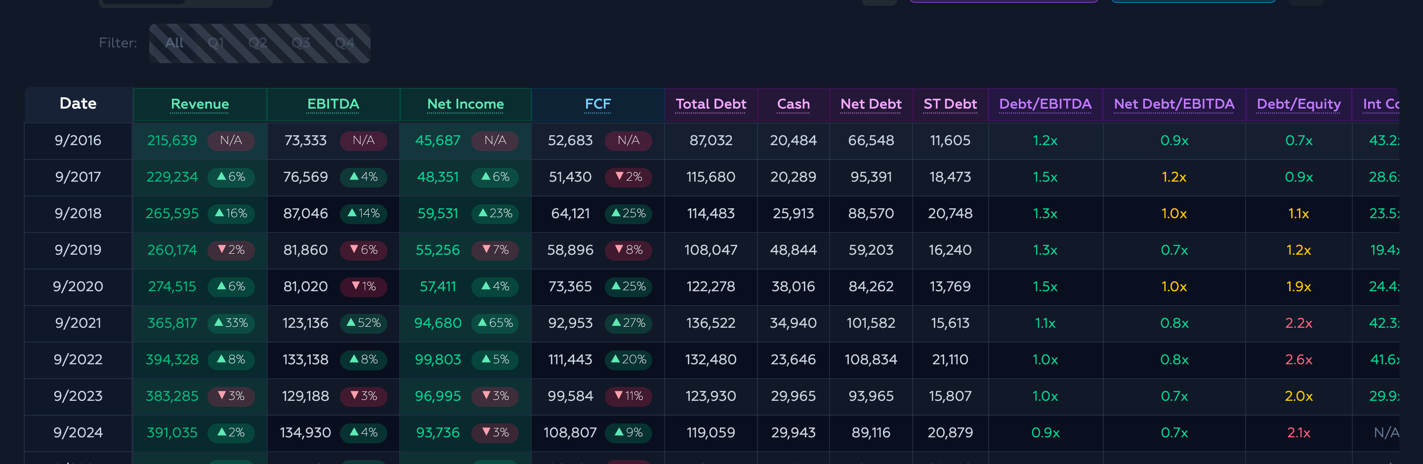
- Margins (gross / operating / FCF): green above 25%, yellow above 10%, red at or below 0%.
- Debt/EBITDA: green ≤ 2×, yellow ≤ 4×, red above.
- Net Debt/EBITDA: green ≤ 1×, yellow ≤ 3×, red above.
- Debt/Equity: green ≤ 1×, yellow ≤ 2×, red above.
- Interest Coverage: green ≥ 5×, yellow ≥ 2×, red below.
- Current Ratio: green ≥ 1.5×, yellow ≥ 1×, red below.
- Payout Ratio: green ≤ 60%, yellow ≤ 80%, red above.
The thresholds are rules of thumb, not verdicts — a capital-light software business and a regulated utility carry debt on very different terms.
What it’s for (and isn’t)
The Fundamentals Table is a fast read of a company’s financial history in one place: enough years and quarters to see a trend, the three statements side by side, and the margins and ratios pre-computed so you don’t have to. It is built for scanning — spotting where revenue stalled, when margins compressed, whether debt grew faster than the earnings meant to service it.
It has limits worth stating plainly. Every number is as-reported and lags the period by its filing date; the ratios use trailing figures, not forward estimates; and a table cannot tell you why a line moved. For the reactions behind the numbers, pair it with Price Events; for the ownership side of the story, Share Count. When you want each line item broken out in full detail, the View detailed financials link under the table opens the complete statements.
Open any company in ValueMap and scroll to the Fundamentals section to see its own history.