
The Share Count tool plots a company’s stock price against how its share count and capital-allocation actions have changed over time, so you can read one thing at a glance: whether each share is becoming a larger claim on the business or a smaller one. It lives on every company page in ValueMap (at valuemap.io/stocks/<symbol>, in the Share Count section), covers roughly ten years of history, and needs a ValueMap login because it sits on the company pages. The chart at the top of this page shows Intuit (INTU).
The two regions
The chart is split into two stacked regions that share the same time axis.
- The top region is the stock’s price line (blue), read off the left axis in the company’s reporting currency. It is the same in every view — only the bottom changes.
- The bottom region is one bar per reporting period for whichever view you have selected. The right axis labels those bars (dollars, or a percent, depending on the view).
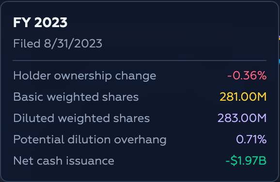
Hovering any period highlights that column and opens a tooltip with the exact figures. The tooltip header names the period — FY 2023 in the yearly view, or 2024 Q2 in the quarterly view — and the date those numbers were filed with the SEC. The rows underneath change with the selected view.
The four views
Four buttons switch what the bottom bars measure.

Buybacks— gross cash spent repurchasing common stock (green bars).Cash Issuance— gross cash received from issuing common stock (red bars).Net— the change in your ownership per share (green when it rises, red when it falls).Stock Comp— stock-based compensation as a percent of the company’s market value of equity (amber bars).
Net is the default: open the tool on any company and it starts here. The views are kept separate on purpose, because they answer different questions. A company can spend billions on Buybacks and still dilute you if it hands out stock faster than it retires it, so the cash it spent and the ownership you ended up with are not the same number.
Yearly and quarterly
A second toggle switches the reporting period.

Yearly uses full-year (FY) statements — up to the last ten fiscal years. Quarterly uses quarters — up to the last forty, which is also about ten years, at four times the resolution. The tool opens on Quarterly, which is what the charts on this page show; switch to Yearly when you want a cleaner, lower-resolution overview.
Net: your ownership per share
Net answers the owner-level question directly, so it is the view to start with.
The bottom bars are holder ownership change: the percent change in basic weighted shares from one period to the next, flipped so the sign matches your interest. When the share count falls, the bar is green — each remaining share owns a little more of the company. When the share count rises, the bar is red — you were diluted, from whatever cause. Concretely, the bar is (basic shares previous / basic shares current − 1) × 100.
The top region also gains two lines on a right axis:
- Basic weighted shares (gold, solid) — the best proxy for the claim current holders actually had during the period.
- Diluted weighted shares (violet, dashed) — basic shares plus the claims waiting in the wings: options, restricted awards, convertibles, and similar instruments.
The gap between those two lines is the potential dilution overhang — dilution that has not happened yet but is parked nearby. The tooltip reports the ownership change, both share counts, the overhang, and the period’s net cash issuance.
Buybacks
The Buybacks view shows gross buyback cash — the money spent repurchasing common stock each period, taken from the cash-flow statement.
This is a spending figure, not an ownership figure. The tooltip pairs the gross buyback cash with an estimated ownership lift — an approximation of how much your slice grew from those repurchases, derived from the cash spent, the average price over the period, and the share count. It is an estimate, which is precisely why Net exists as its own view: sometimes buybacks retire shares faster than the company creates them and genuinely enrich owners; sometimes they only offset dilution from compensation plans; sometimes they subsidize issuance happening elsewhere.
Cash issuance
The Cash Issuance view shows gross cash received from issuing common stock — offerings, employee purchase plans, option exercises, and other equity issuance events.
Its tooltip mirrors Buybacks: the gross cash raised plus an estimated drag on your ownership. One caveat matters here. This is a cash-flow measure, so it captures cash-funded issuance only. Non-cash dilution — shares handed out in acquisitions, conversions, or restructurings — never appears in this view, but it still shows up in Net. That is why Net remains the owner-level truth and Cash Issuance is only one of the mechanisms feeding it.
Stock comp
The Stock Comp view shows stock-based compensation as a percent of the market value of equity for each period — the reported stock-comp expense divided by market cap.
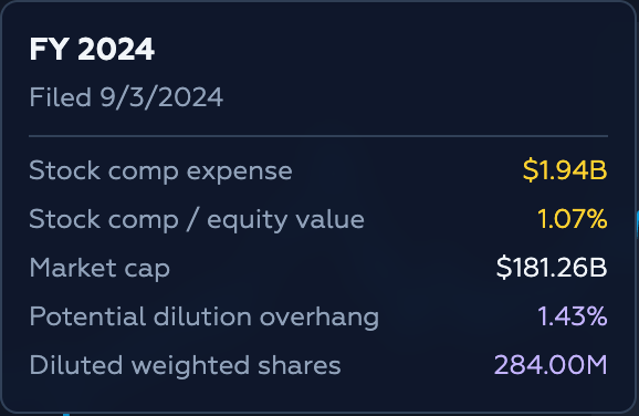
The percentage framing is deliberate. In raw dollars a large company’s stock comp can look harmless — a billion dollars is easy to shrug off against a huge market cap — but as a share of what the market says the business is worth, the burden is comparable across time and across companies. The tooltip lists the stock-comp expense in dollars, that same figure as a percent of equity value, the market cap it was measured against, the potential dilution overhang, and the diluted share count.
How the numbers are computed
The views are built from three sources: weighted-average share counts come from the income statement, the buyback / issuance / stock-comp figures from the cash-flow statement, and market cap from the key-metrics data. Bars are drawn only for periods that overlap the price history on screen.
- Holder ownership change =
(basic shares previous / basic shares current − 1) × 100 - Potential dilution overhang =
(diluted shares − basic shares) / basic shares × 100 - Stock comp / equity value =
stock-based compensation / market cap × 100 - Estimated ownership lift / drag =
(buyback or issuance cash / average price over the period) / basic shares × 100
The estimated lift and drag in the Buybacks and Cash Issuance tooltips use the average price over each period, so treat them as approximations. The realized outcome is what Net measures.
Reading the four views together
The tool is most useful when the views are read against each other rather than in isolation.
- High
Buybacksand positiveNet— the repurchases are creating real accretion. - High
Buybacksand flatNet— the repurchases are mostly neutralizing issuance. - High
Buybacks, elevatedStock Comp, and negativeNet— owners are funding a compensation program while the share base still grows. - Quiet issuance, modest
Stock Comp, and positiveNet— the buybacks are doing what buybacks are supposed to do.
A workable order is: start with Net to see what happened to the owner, then check Buybacks, Cash Issuance, and Stock Comp to see which mechanism drove it.
What it’s for (and isn’t)
A share is a claim on the business, and the share count is the denominator of that claim. Price alone cannot tell you whether the denominator is shrinking or growing, and neither can a buyback headline. The Share Count tool separates the mechanisms — buybacks, issuance, stock comp — from the outcome in Net, so that money spent on repurchases is not mistaken for ownership gained.
It has limits worth stating plainly. The lift and drag figures in the cash-flow views are estimates; non-cash dilution shows up only in Net; and every number is as-reported, lagging the fiscal period by its filing date. It is a fast read of a company’s capital structure, not a replacement for reading the filings.
Load any company in ValueMap and open the Share Count section to see its own history.