
The ValueMap screener narrows the universe of listed stocks down to the ones that meet the criteria you set, and then ranks whatever survives by the value metrics you care about. It is free, it lives at valuemap.io/screener, and it needs no login. It covers the roughly 4,500 US-listed companies out of the box (more once you add other exchanges), draws on over 100 value metrics, and refreshes daily.
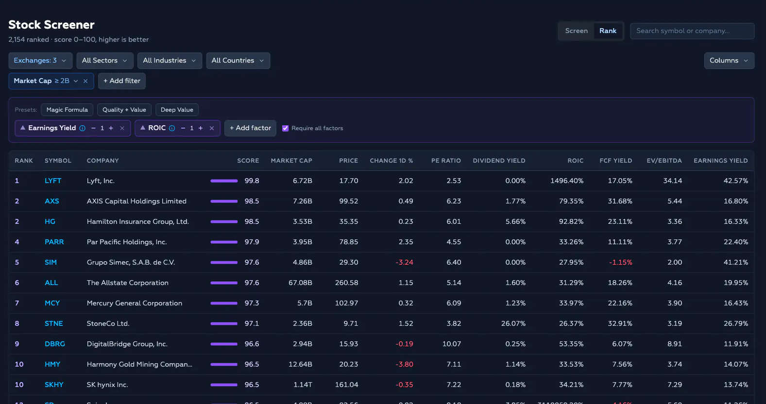
Most screeners only filter: you get a flat list of everything that passed. ValueMap’s also ranks, so you get an ordered shortlist with the strongest candidates on top. The rest of this page walks through each control.
Screen or Rank
The screener has two modes, toggled at the top right. They answer two different questions.

Screen answers what am I allowed to look at? You set hard constraints and the universe collapses to the rows that pass every one. A filter is binary: a stock either clears the hurdle or it disappears from the list.
Rank answers among what’s left, which are best? You pick factors and the tool orders the survivors by a composite score. Ranking is continuous: nothing is excluded for being mediocre, it just sinks down the list.
The two modes stack. You filter first to define the pond, then rank inside it. Rank mode is the default, and it starts loaded with the Magic Formula (more on that below).
The control bar
Everything you configure lives in three rows above the table.
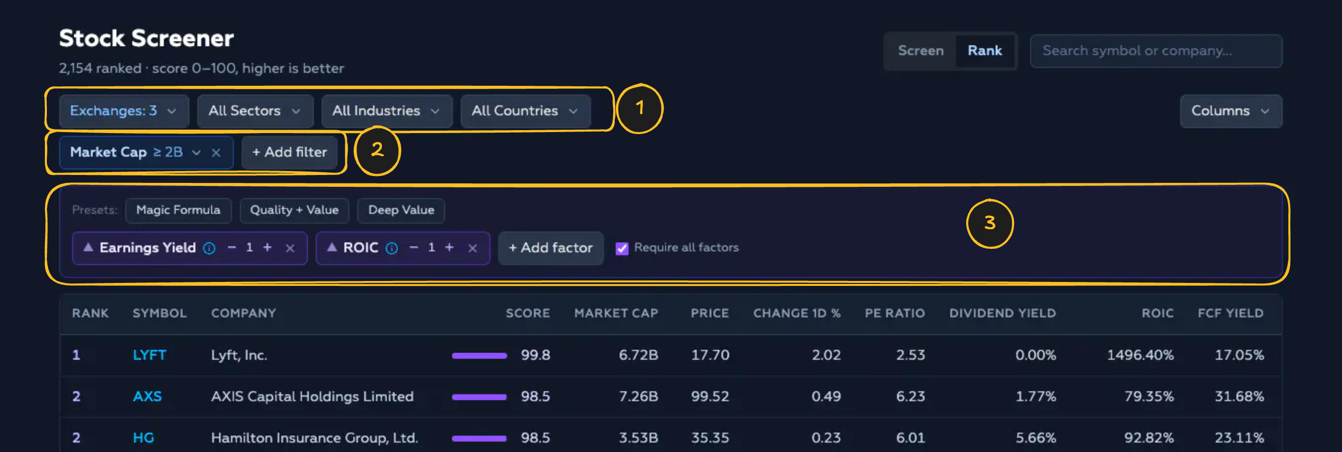
- Category filters narrow the universe by Exchange, Sector, Industry, or Country.
- Value filters constrain individual metrics (market cap, debt, yield, and so on). There are over 100 to choose from, most with sensible presets.
- Ranking factors (Rank mode only) decide which metrics the survivors are scored and ordered by.
Choose your universe
The first row holds four multi-select dropdowns: Exchanges, Sectors, Industries, and Countries. Open one, tick the values you want, and the table updates immediately. Each dropdown has a search box and a clear button, and you can select as many values as you like.

By default the screener is limited to the US exchanges (NYSE, NASDAQ, AMEX). That is deliberate: market caps are reported in each listing’s native currency, so a global market-cap sort would rank a Japanese bank at ¥41T above Apple purely because the number is larger. Remove the exchange filter when you mean to, and read cross-country size comparisons with care.
Add a value filter
Click + Add filter to open the metric picker. Start typing to search, or scroll the grouped list (Valuation, Dividends, Quality, Safety, Deep Value, Price, Efficiency, Per Share, Financials). Click a metric and it becomes a filter chip below the row. The i icon next to any metric opens its definition.
Set the filter value
Click a chip to set its value. Every numeric filter offers two things: a set of one-click presets and a custom range with a minimum and a maximum. The range inputs accept magnitude suffixes, so you can type 10B for ten billion or 500M for five hundred million. Leave a bound empty for an open-ended filter (only a minimum, or only a maximum).
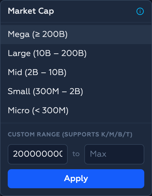
To remove a filter, click the × on its chip. The universe reopens to whatever the remaining filters allow.
A Japanese bank at ¥41T will out-sort Apple on a naive global market-cap ranking, because the number is bigger, not the company. That is why the default universe is the US exchanges. Remove that filter deliberately, not by accident.
Rank the survivors
Switch to Rank mode to score the filtered universe. Instead of a # column you now get a Rank and a Score, and the list is ordered by score rather than by whichever column you clicked.
Ranking is built from factors: the metrics you think express a good opportunity. The Presets row gives you three ready-made factor sets in one click, and you can add, remove, or reweight factors from there.
Add and weight factors
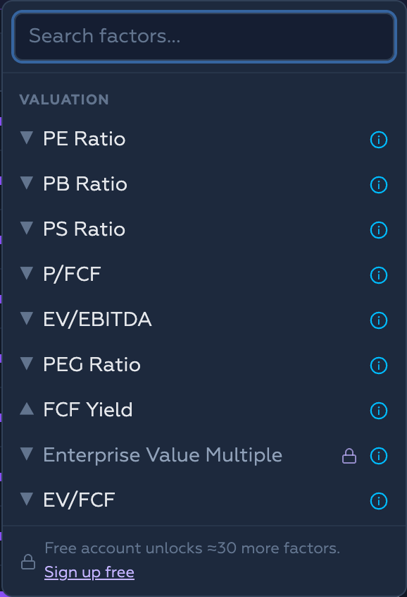
Click + Add factor to add your own. Each active factor becomes a chip with three things:
- A direction arrow. ▲ means higher is better (earnings yield, return on capital); ▼ means lower is better (PE, price-to-book). The tool orients each factor automatically so that a better company always scores higher.
- A weight (
−/ value /+, from 1 to 10). A factor weighted 2 counts twice as much as one weighted 1 in the composite score. - A remove button (
×).
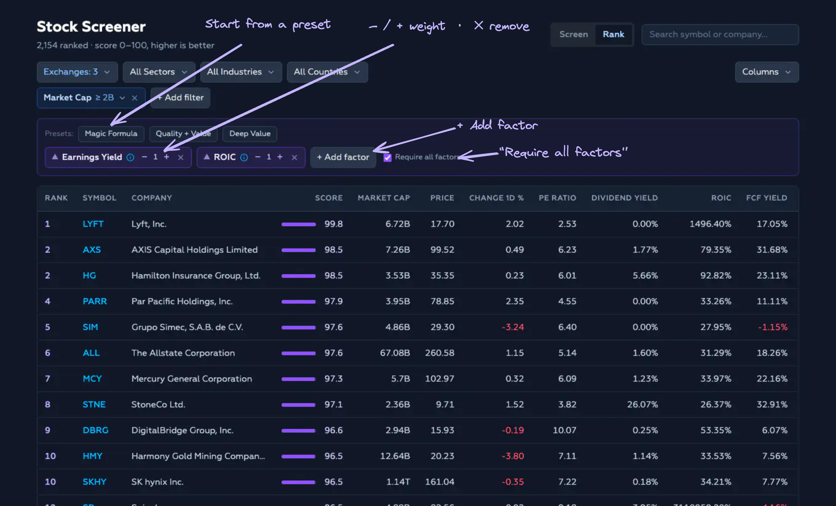
Require all factors (on by default) drops any company missing data for one of your factors, so nothing is ranked on incomplete information. Turn it off to keep partial rows, which then land at the bottom of the missing factor.
A handful of factors are marked with a padlock; a free account unlocks around 30 more.
How the score is calculated
Joel Greenblatt’s original Magic Formula made the key observation: you cannot simply add two metrics measured in different units. An earnings yield of 8% and a return on capital of 25% live on incompatible scales. His fix was to rank every company on each metric separately, then add the ranks.
The screener does the same thing with percentiles. For each factor it scores every company against the rest of the filtered universe,
oriented so that 100 is always best. Then it blends the factors by the weights you set:
The result is a 0–100 score where higher is better. Each stock also carries its rank: its true position among every company that passed the filters, not just the page you happen to be looking at.
Why percentiles instead of raw values?
- They are robust to outliers. A company showing a return on capital of 270x — almost certainly a denominator artifact — is simply “top of the pile,” worth no more than the honest 60% just below it. One lunatic number can’t hijack the ranking.
- They are scale-free. You can blend an earnings yield (a small fraction), a Piotroski score (an integer from 0 to 9), and net-debt-to-EBITDA (a leverage multiple) and the composite stays coherent, because everything was flattened onto the same ladder first.
- They are honest about missing data. A stock missing a factor lands at the bottom for that factor, never the top, so you can’t accidentally reward a company for having no number.
Read the results table
Every figure is trailing-twelve-month (TTM) and as-reported. The screener describes the company as it is, not as an analyst forecasts it will be, and the whole set refreshes daily. Reading a row left to right:
- Rank / # — position in the ranked (or filtered) universe.
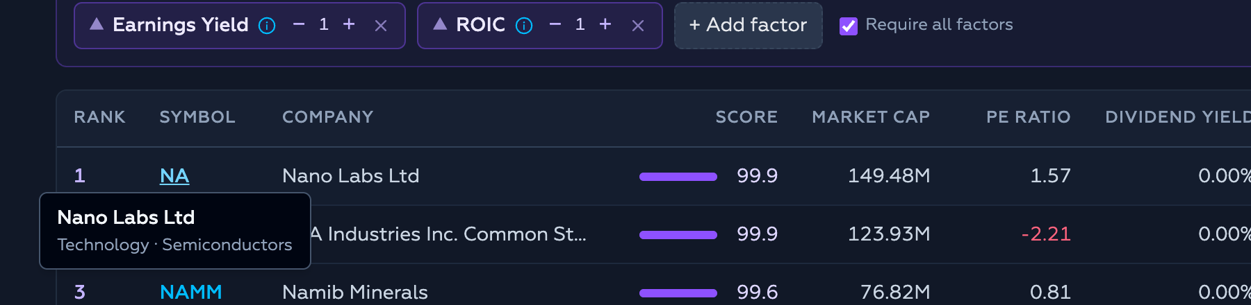
- Symbol — links to the full stock page. Hover it for the company name, sector, and industry.
- Score — the 0–100 composite, drawn as a bar so you can see the gap between the leaders and the pack. Hover the bar for the per-factor percentile breakdown behind the number.
- Metric columns — the data points you chose to display. Negative values render in red.
Choose your columns
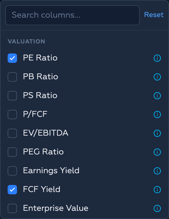
The Columns button opens a searchable, grouped list of every metric. Tick or untick to show or hide columns; your selection is remembered in your browser between visits. Any metric you filter or rank on is shown automatically, whether or not it is ticked. Reset restores the defaults.
You can also drag a metric column’s header sideways to reorder it.
Sort
In Screen mode, click any column header to sort by it. Click again to switch between descending, ascending, and back. The active column shows a small arrow. (In Rank mode the list is always ordered by score, so header-sorting is off.)
Page through results and search
The table shows 50 stocks per page, with Previous / Next controls and the total count at the bottom. To jump to a specific company within your results, type part of its ticker or name into the search box next to the mode toggle.
Share a screen with a link
The screener has no separate “save” button because it doesn’t need one: your entire configuration — filters, factors, weights, sort, and page — lives in the page URL. Copy the address bar to bookmark a screen or send it to someone else, and it reopens exactly as you left it.
The starter recipes
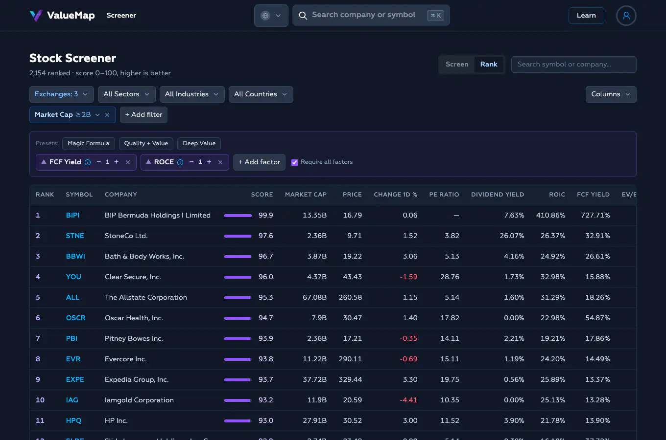
The three presets each encode a different bet about what makes a business worth owning. The screenshots below were all run on the same pond — US exchanges with a Market Cap ≥ $2B filter added — which keeps the microcap swamp, where the data is thinnest, out of the picture.
Magic Formula
Greenblatt’s original: earnings yield and return on capital, equal weight. Cheap and good — the bet that the market underprices quality compounders.
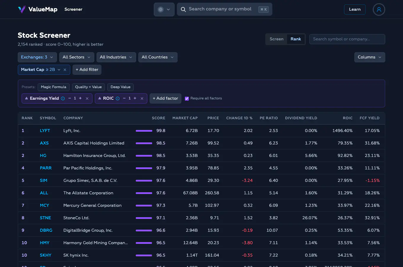
One thing the result quietly teaches: insurers cluster near the top (AXIS, Hamilton, Allstate, Mercury). That is not a glitch — insurance businesses genuinely screen cheap on earnings yield — but it is a sector tilt worth noticing rather than accepting blindly.
Quality + Value
Cheapness measured by free-cash-flow yield rather than earnings, paired again with return on capital. A more defensive, cash-based tilt: it rewards businesses that actually convert profit into cash, which is harder to fake than accounting earnings.
Deep Value
Pure Graham: low PE, low price-to-sales, and low price-to-book, all at once — statistically cheap on every line.
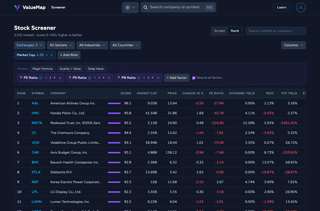
Watch for a trap here: several top-ranked names may have a negative PE, and a “lowest PE” ranking reads a loss as the cheapest thing on the board. Deep Value, more than any other recipe, rewards adding a positive-earnings filter and reading every name before you get interested.
What the output is (and isn’t)
The output is a shortlist, not a verdict. A score of 98 does not mean “buy.” It means “of the companies that passed your filters, this one ranks near the top on the factors you chose.” Both halves of that sentence carry weight. If your filters were sloppy, the top of the list is the top of a bad universe. If your factors don’t capture what actually makes a business valuable, a high score is measuring the wrong thing precisely.
So the discipline is:
- Put your margin of safety in the filters. The non-negotiables that would disqualify a company belong here.
- Put your thesis in the factors. The ranking is where you express what you think creates returns.
- Then do the work. The screener’s job ends when the list is twenty names long. It cannot read a 10-K, judge a management team, or notice that the cheap retailer is cheap because Amazon is eating it. Every name that survives to your shortlist is a hypothesis — and the point of narrowing the universe was to have the time to test each one properly.