
Net Income & P/E Ratio
The Net Income & P/E Ratio chart lives in the Valuation section of every stock page on ValueMap (for example, valuemap.io/stocks/AAPL, then scroll to Valuation). You need to be signed in to a ValueMap account to open it. It puts three things on a single set of axes – trailing-twelve-month net income, the stock price, and the price-to-earnings ratio – so you can read a company’s earnings, its price, and the multiple the market is paying, all at once.
The chart below is the real, interactive tool, loaded here with Apple (AAPL). Hover across it to read any date, and press and drag to compare two points – exactly as it behaves on the stock page.
Everything on the chart is trailing-twelve-month (TTM) and as-reported. It requests up to six years of history (24 rolling TTM periods) and draws them against the daily price line.
What the chart plots
There are three data series and two vertical axes.
- Net Income – the blue (or red) bars, read against a hidden value scale. Each bar is one quarter’s trailing-twelve-month net income.
- Price – the green line, read against the left axis (in dollars).
- P/E Ratio – the amber line, read against the right axis (in multiples, e.g.
30x).
The bottom axis is time. The three zero points are aligned: $0 of net income, $0 of price, and 0x on the P/E axis all sit on the same horizontal line, so a bar dropping below the baseline and the multiple crossing zero mean the same thing at the same height.
Net income bars
The bars are trailing-twelve-month net income, one per reported quarter. They are blue when positive and red when negative, and they hang below the baseline in the quarters a company lost money. Because the figure is trailing-twelve-month, each bar already sums the four most recent quarters, so a single seasonal quarter doesn’t whipsaw the picture – you’re looking at the run-rate of annual profit as it was actually reported.
The price line
The green line is the daily closing price over the same window, drawn against the left dollar axis. It is the only series with a data point every trading day; the bars and the multiple move in steps as new filings arrive, while the price moves continuously underneath them.
The P/E ratio line
The amber line is the price-to-earnings multiple, read on the right axis. It is computed pointwise, for every price date, as:
The subtlety is which earnings number each price is divided by. For any given day, the chart uses the most recent trailing-twelve-month EPS that had already been filed on that date – not the quarter that had merely ended. Companies report 45 days to three months after a quarter closes, and the market can only price earnings it has actually seen. Dividing today’s price by earnings that won’t be public for another two months would invent a multiple nobody could have traded on.
That is why the amber line steps down (or up) on filing days rather than on quarter-end days: a new filing swaps in a fresh TTM EPS, and every subsequent price is divided by that number until the next filing lands.
A P/E can briefly explode when earnings are barely positive – a company that earns a few cents a share can show a multiple in the hundreds. Rather than let one such spike compress everything else into a flat band near the bottom, the right axis is scaled to the 95th percentile of the observed multiples. The extreme readings still draw; they just don’t get to own the whole axis.
When earnings turn negative, the line breaks
A price-to-earnings ratio built on negative earnings is meaningless – a “P/E of -8x” tells you nothing about how expensive a stock is. So when trailing-twelve-month EPS is zero or below, the chart simply stops drawing the amber line. The multiple reappears only once the company has filed a positive TTM again.
Carnival (CCL), loaded live above, shows the whole arc. The bars run deep red through the pandemic-era losses, and there is no P/E line at all during those years – there was no meaningful multiple to plot. When the trailing-twelve-month figure finally crosses back above zero, the amber line resumes, starting high (earnings were only just positive) and compressing as profits recover. The gap in the line is information: it marks exactly the stretch when the company had no earnings to value.
Filing-date markers
The faint dotted verticals, labelled Filing, mark the dates the company filed with the SEC. They are the moments the amber line is allowed to change, and they line up the two halves of the story: the day the market learned a new earnings number is the day the multiple it was willing to pay was recomputed.
Hover for the exact numbers
Move along the chart and a tooltip tracks the nearest price point, a crosshair drops to it, and the bar whose earnings produced that day’s multiple lights up – with a soft gradient linking the point on the amber line back to the bar it was calculated from.
The tooltip spells out the full calculation for that date:
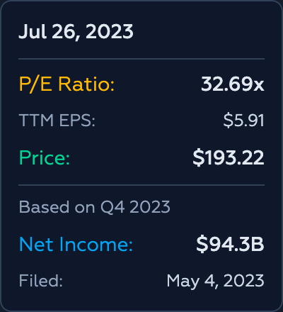
- P/E Ratio and the TTM EPS it was divided by,
- the Price on that date,
- and, below the divider, which quarter the earnings came from (Based on Q4 2023), the Net Income for that trailing-twelve-month period, and the date it was Filed.
Read together, the block is the whole equation: this price, divided by this filed EPS, equals this multiple.
Drag to compare two dates
Press and drag across the chart to select a span. An overlay reports how the price and the multiple changed between the two endpoints – the price as a percentage, the P/E as an absolute change in turns (e.g. 23.0x → 10.9x).
This is where the chart earns its keep. A stock can rise sharply while getting cheaper, if earnings grow faster than the price. Carnival did exactly that coming out of its losses: the price climbed by more than half, yet the P/E fell from the low-twenties into the low-teens, because the denominator – earnings – was growing faster than the numerator. Drag the range and the overlay shows both moves side by side, so you can tell price appreciation from multiple expansion instead of confusing the two.
What it’s for (and isn’t)
The chart answers one question: is the price being driven by earnings, or by the multiple? When the bars grow and the amber line stays flat, a rising price is being paid for with profit. When the bars are flat and the amber line climbs, the price is running on multiple expansion – the market is simply willing to pay more for the same dollar of earnings, which is another way of saying it is running on sentiment.
Neither is a verdict. A rising multiple can be justified by a genuinely improving business, and a falling one can be a value trap on a company whose earnings are about to roll over. What the chart removes is the guesswork about which is happening. It puts profit, price, and the multiple on the same axes, marks the days the numbers actually became public, and refuses to draw a P/E where there are no earnings to divide by. The interpretation is still yours to do.