
Insider Activity
The Insider Activity tool plots a company’s stock price against every insider transaction its officers, directors, and large owners have filed with the SEC, so you can see at a glance when the people who run the business were buying or selling their own shares. It lives on every company page in ValueMap (at valuemap.io/stocks/<symbol>, in the Insider Activity section), covers roughly six years of history, and needs a ValueMap subscription because insider filings are a paid data feed. The chart below shows Northrim BanCorp (NRIM), an Alaskan community bank whose insiders trade often enough to make the patterns easy to read.
The chart and the transaction log beneath it are one view, not two. The bubbles and quarterly bars summarize the same filings the log lists row by row, and every control acts on both at once: hover the price line for a tooltip, hover a quarter’s bars for its totals, click a quarter to narrow the log, and filter by insider title to reshape the whole thing. The rest of this page walks through each part.
The two regions
The chart stacks two regions on one shared time axis.
- The top region is the stock’s price line (blue), read off the left axis in dollars. Sitting on that line are the transaction bubbles — one per cluster of insider trades, placed at the price on the day they happened.
- The bottom region is a set of quarterly bars: for each quarter, the total dollar value insiders bought (green) next to the total they sold (red).
The two regions answer different questions. The bubbles tell you when, at what price, and how big a given insider trade was. The bars step back and ask which quarters were net-buying quarters and which were net-selling, so a single large sale doesn’t get mistaken for a trend.
Buy and sell bubbles
Each bubble on the price line marks a group of insider trades that happened close together in time, placed at the price on the day they occurred. When a bubble stands for more than one filing, the number of trades is printed inside it.
Color encodes direction:
- Green — all buys.
- Red — all sells.
- Violet — mixed (some insiders bought while others sold around the same time).
Size encodes money: the bigger the bubble, the larger the total dollar value of the trades it represents. When you need the exact figure, read it off the tooltip or the log rather than the bubble’s area.
The practical read is that a big green bubble — real money, out of an insider’s own pocket, at a known price — is the single most interesting mark on this chart. An insider can talk a stock up for many reasons; buying a large slice of it with their own cash is expensive and hard to fake.
The price line and its tooltip
Moving the pointer across the top region drops a dashed crosshair and snaps a marker to the nearest day on the price line. The tooltip shows the date and the closing price there, and — if any insider traded within seven days of that date — a short list of the nearby transactions, each tagged Buy or Sell with its dollar value (the three largest, with a “+N more” if there were others).
This is how you tie a bubble back to a price. A green bubble sitting at a local low tells you an insider stepped in while the stock was down — a different signal than the same insider buying after a run-up.
Quarterly summary bars
The bottom region aggregates the same transactions into quarters. Each quarter gets two bars: purchases (green, on the left) and sales (red, on the right), each the summed dollar value of that side for the quarter. The right side of the reading is deliberately coarse — quarter-by-quarter — because that is the timescale at which insider behavior (as opposed to a one-off trade) shows up.
Hovering a quarter highlights its full column and opens a tooltip with the purchase and sale totals for that quarter.
Because the bars and the bubbles share the time axis, you can line them up directly: a tall green bar with a cluster of green bubbles above it is a quarter where insiders were accumulating; a tall red bar is a quarter where they were cashing out.
The Purchases / Sales legend
The legend above the chart is interactive. Clicking Purchases or Sales toggles that side off, dimming both its bubbles’ contribution and its bars, and rescales the bar axis to what’s left. Turn off sales to study accumulation on its own; turn off purchases to isolate distribution. Price and the mixed (Both) marker are always shown.
The transaction log
Directly below the chart, in the same view, is the full Transaction Log — every filing behind the bubbles, one row each. It is not a separate report; it is the itemized version of what the bubbles and bars summarize, and it reacts to the same controls.
Reading a row left to right:
- Insider — the name of the person or entity that filed.
- Relationship — their role as reported (e.g. “Chief Executive Officer”, “Director”, “10% Owner”).
- Date — the transaction date.
- Type — Buy (green) or Sell (red).
- Cost — the per-share price of the transaction.
- #Shares — the number of shares transacted.
- ΔOwn — the change in that insider’s own holdings this transaction represents, as a percent. A first-time filer shows New instead of a percentage.
- Value — the total dollar value of the transaction.
- Total — the insider’s total share count after the transaction.
- SEC Form 4 — a link to the original filing on the SEC’s site, labeled with the filing date.
Every row is tinted green or red by direction, and each column header sorts — click once to sort ascending, again to flip. The log opens sorted by date, newest first.
Clicking a quarter’s bars up in the chart narrows this log to just that quarter’s filings and shows the selected quarter as a chip you can clear — the fastest way to get from “that quarter looks interesting” to the exact trades behind it. The quarter filter only narrows the log; the graph keeps showing the full history.
Filtering by insider title
Not every insider carries the same weight. A dropdown above the log filters by title category, derived from each filer’s raw relationship string into a standard set: CEO, CFO, COO, COB (Chairman of the Board), President, VP, GC (General Counsel), Director, 10% Owner, and Other. Only the categories actually present for the company appear in the list.
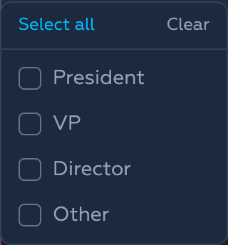
Selecting one or more categories filters both the chart and the log at once, so you can isolate, say, only the CEO’s and CFO’s trades and watch the bubbles and quarterly bars redraw with them. Leaving the filter empty shows everyone.
The distinction matters because a 10% Owner selling is often a fund rebalancing, while a CEO or CFO buying is a direct bet by the person with the most information about the business.
Reading insider activity
A few honest rules of thumb for what the marks mean.
- Buys are a cleaner signal than sells. Insiders sell for dozens of reasons that have nothing to do with the company — taxes, a house, diversification, an expiring option. They generally buy for exactly one: they think the stock is worth more than it costs. A cluster of green, especially from a
CEOorCFO, is worth a closer look. - Size and context matter more than count. Ten tiny automatic sales tell you less than one large discretionary purchase. Line the bubble up against the price line — buying into weakness reads differently than buying into strength.
- Watch the quarterly balance. One red bar is noise. Several red quarters in a row, with no green anywhere, is a pattern — the people who know the business best have been consistently reducing their stake.
- Follow the form. Every row links to the actual SEC Form 4. When something looks significant, read the filing; it will tell you whether a sale was an open-market decision or a pre-scheduled, automatic transaction.
What it’s for (and isn’t)
Insiders are not oracles. They are wrong about their own companies all the time, they buy stocks that fall and sell stocks that soar, and a single trade proves nothing. What this tool gives you is not a verdict but a question generator: it surfaces the moments when the people with the most information and the most at stake put their own money on the line, and it puts those moments next to the price so you can ask why here, and why this size.
It has limits worth stating plainly. Coverage is US-listed companies with Form 4 filings, so a foreign or thinly-covered name may show nothing even with a subscription. Every figure is as-reported and lags the transaction by its filing date. And the tool shows that an insider traded, never why — that answer is in the filing, the proxy statement, and the business itself.
Load any company in ValueMap and open the Insider Activity section to see who has been buying and selling its stock.